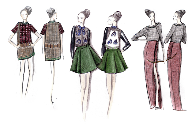
You know how when you get something from the thrift store and you show you friend and you're like "hai this is the new skirt that I just got, I mean it's old but it's new, it's an old skirt but it's new to me but it's like actually old." Well these drawings are like that, I made them last month for the Terracotta Warriors Inspired Fashion Design Competition (phew, long name). So they are old to me and new to you.
These didn't get picked but I thought they were cute enough to share. But looking back at them, they do seem kind of flat and lackluster. I can see how they wouldn't be too appealing to the judges. I actually quite like the green outfit in the middle, the little bomber jacket with patent leather sleeves and the stiffly pleated olive skirt. That's another thing, I think these illustrations could really benefit from some arrows and written commentary. The boards which I actually sent in did include fabric swatches but I think it needs more than that from a presentation standpoint. At my old job at Li & Fung as the assistant designer, I was mainly in charge of visual communications and I spent a lot of time making presentation boards for buyers and we never would have sent these out: first of all the image needs a background (a muted complementary tone with some texture preferably), the figures would have had a shadow and the clothes need texture. Even if the clothes were boring we would have wowed them with the general presentation, and that's what I'm lacking here. I think I got a little lazy and fancied my drawings could speak for themselves. But you learn.
This week I've been snail-making that DETOUR 2012 piece (but really mostly drinking Baileys and watching Bones). Here's what I've been working on? Frankly I'm
 |
| I've created a monster/ So hideous I didn't even Instagram it/ Imagine my horror. |


haha such a cute monster and i am madly in love with your blog header.
ReplyDeletemy blog : http://www.christianyuen.blogspot.com/
greetings from hong kong.
╰╮o( ̄▽ ̄///)
cheers,
chris
Hey Chris! Thanks, it's a monster indeed.
ReplyDeleteGreetings from HK also,
Kitty